|
CodeLab UI Designer
How to use the CodeLab User Interface Builder
When CodeLab starts, it loads a default script that contains a Render() function and a set of three integer slider controls. CodeLab stores the user interface (UI) controls in a #region in your CodeLab script as shown below:
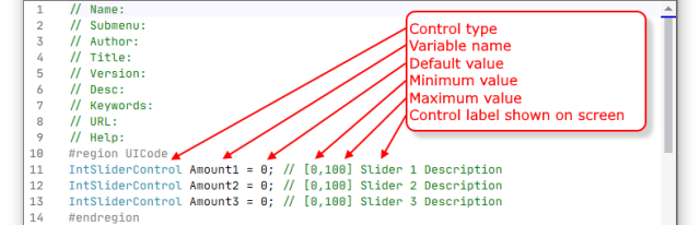
Here you can see the way CodeLab interprets the UICode region. Normally, // comments have no consequences for how a C# compiler compiles your code. However, CodeLab is not a normal compiler. CodeLab uses these comments to better define exactly what type of control you want on your effect's UI and how it should act. This comment can be more complex than what is shown, but don't worry, you don't have to remember how any of this works--simply use CodeLab's UI Designer and it will all be managed for you.
In CodeLab, use File > User Interface Designer (or press Ctrl+I) and the User Interface Designer will read your script's UICode region and present you with a UI editor:
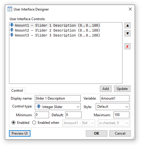
On this screen, you can see a large box in the center that holds a list of your controls. Below that box, there is a "Control" section that shows the details of the selected UI control from the box above.
The User Interface Controls list can be managed with the following buttons:
- [^] Move the selected UI control higher in the list.
- [v] Move the selected UI control lower in the list.
- [x] Delete the selected UI control.
Clicking on a UI control in the list will select it and fill in the "Control" section at the bottom of the screen with the details of the selected control. At this point, you can make changes in the "Control" section and press [Add] to add a new control to the bottom of the list or press [Update] to modify the currently selected control with the changes you've just made.
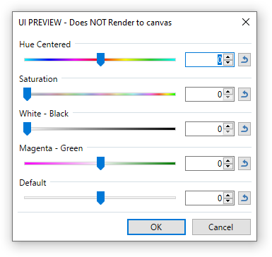
At any time, you can press [Preview UI] to see what your UI looks like and how it works. The UI defined above would look like this:
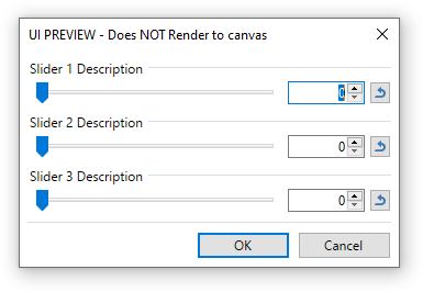
In the preview, you can play with your controls and see how they interact, however this tinkering does not reflect on the Paint.NET canvas.
Your effect is not limited to just integer sliders. Paint.NET supports the following UI controls:
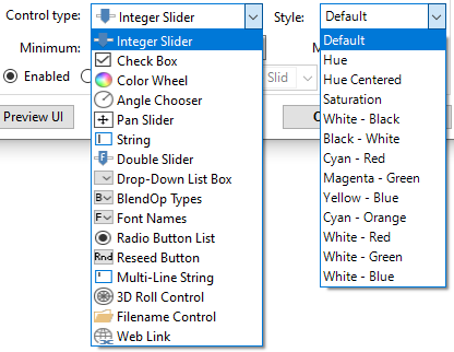
Some controls, like the Integer slider and Double slider have styles that you can choose to go along with them. Here is what integer sliders look like with different styles applied to them:
The Color Wheel control also has several styles to choose from:
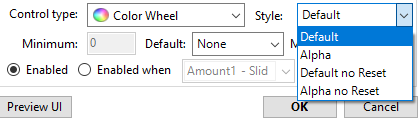
Here's how each one of those look:
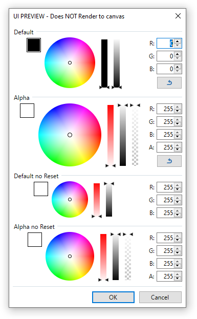
Choose the style that has the features your effect will need. For example, if you don't need your selected color to have alpha, choose the "Default" or "Default no Reset" styles. Then, your selected color will always have full alpha (255).
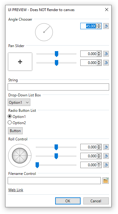
Here is how the other controls that we haven't shown yet look:
Your effect can have as many or as few controls as you require.
When you select a control type in the drop-down list box, some of the Min, Max, or Default boxes may become disabled. In those cases, that information can not be changed for that type of control. For example, for a check box, the minimum value is always 0 (not checked) and the maximum value is 1 (checked). You can only supply the default state of the check box in the Default box.
The Min, Max, and Default boxes are "tied together" to keep you from entering illegal value combinations.
One last feature on this page I'd like to cover is disabled controls. Sometimes you might need one or more of your controls to be disabled unless a checkbox is checked. For example:
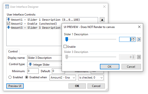
In this example, the second slider, named "Slider 3" in this screenshot, is disabled unless the "Enable" checkbox is checked. This is accomplished by selecting the control you wish to disable and then changing the "Enabled" radio button to "Enabled when" and selecting the condition.
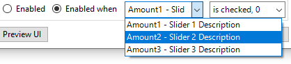
When you select "Enabled when" you can choose the control you wish to use to enable the selected control. In our example above, the Amount 2 checkbox was selected. Then, you can choose the value that will trigger the enabled state of our selected control:
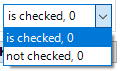
In this drop-down box, read the comma as "or". So, in our example above, Slider 3 is enabled when the Amount 2 checkbox is checked (or 0). That "or 0" is there in case you are basing your enabled state on an integer slider.
Preview UI
At any time while designing your UI you can press [Preview UI] to see how your UI looks and how the Enable/Disable controls work together.
Save
Once you are happy with the way the UI is designed, press [OK] and the UI Designer will update your script's UICode block with your current UI design.
Just understand that just because you've included a slider (or other control) that is defined as "Magenta - Green", for example, it won't automatically update your script to adjust the coloring of the canvas... that part is up to you to code. The UI Designer just updates the UICode block such that your script will compile with the controls you want to include. If you are unsure how to make the control change the image coloring, read Tutorial 2.
More Information
Here is some more information that you may find useful:
Sample Code for User Interface Elements
CodeLab Effects Design Overview
Using the Code Editor
Building a DLL File
CodeLab Help File
Check for CodeLab Updates
Learn C#
|
|
|
News
Sudoku 1.2 Released
(April 19, 2026)
Solve sudoku puzzles for fun! Over 280 puzzles at all levels included.
More...
CodeLab 6.13 Released
(November 17, 2024)
This latest release of CodeLab for Paint.NET includes the
ability to write GPU accelerated plugins.
More...
Double-Six Dominoes 3.1
(May 10, 2021)
This long-awaited refresh of the most popular dominoes game
on Download.com is now available!
More...
|
|
|
|
|
|